Note
Click here to download the full example code
Verification of Probabilistic Forecasts
This example demonstrated how to perform verification on probabilistic forecasts.
Reliability diagrams, sharpness histograms, Receiver Operating Characteristic (ROC) Curves and Precision / Recall Curves are included in this example.
Definitions
Import all required modules and methods:
# Python package to allow system command line functions
import os
# Python package to manage warning message
import warnings
# Python package for time calculations
import pandas as pd
# Python package for numerical calculations
import numpy as np
# Python package for xarrays to read and handle netcdf data
import xarray as xr
# Python package for creating plots
from matplotlib import pyplot as plt

# swirlspy verification metric package
import swirlspy.ver.metric as mt
# directory constants
from swirlspy.tests.samples import DATA_DIR
from swirlspy.tests.outputs import OUTPUT_DIR

warnings.filterwarnings("ignore")
Initialising
In a probabilistic forecast, the probability of an event is forecast, instead of a simple Yes or No.
As always, the forecast and observed values are stored as xarray.DataArrays.
# Extracting a set of probabilities and binary values
# for verification

# This particular forecast xarray.DataArray also includes
# observation data at basetime, so data at the first
# timestep (basetime) is removed
# The array also contains some data above 1, so clipping
# is required
forecast = xr.open_dataarray(
    os.path.join(DATA_DIR, 'ltg/ltgvf_201904201300.nc')
).isel(time=slice(1, None)).clip(min=0, max=1)

# Observation
observation = xr.open_dataarray(
    os.path.join(DATA_DIR, 'ltg/lobs_201904201300.nc')
)

timelist = [pd.Timestamp(t) for t in forecast.time.values]

# Define basetime
basetime = pd.Timestamp('201904201300')

print(forecast)
print(observation)
<xarray.DataArray (time: 12, northing: 500, easting: 500)> Size: 24MB
array([[[0., 0., 0., ..., 0., 0., 0.],
        [0., 0., 0., ..., 0., 0., 0.],
        [0., 0., 0., ..., 0., 0., 0.],
        ...,
        [0., 0., 0., ..., 0., 0., 0.],
        [0., 0., 0., ..., 0., 0., 0.],
        [0., 0., 0., ..., 0., 0., 0.]],

       [[0., 0., 0., ..., 0., 0., 0.],
        [0., 0., 0., ..., 0., 0., 0.],
        [0., 0., 0., ..., 0., 0., 0.],
        ...,
        [0., 0., 0., ..., 0., 0., 0.],
        [0., 0., 0., ..., 0., 0., 0.],
        [0., 0., 0., ..., 0., 0., 0.]],

       [[0., 0., 0., ..., 0., 0., 0.],
        [0., 0., 0., ..., 0., 0., 0.],
        [0., 0., 0., ..., 0., 0., 0.],
        ...,
...
        ...,
        [0., 0., 0., ..., 0., 0., 0.],
        [0., 0., 0., ..., 0., 0., 0.],
        [0., 0., 0., ..., 0., 0., 0.]],

       [[0., 0., 0., ..., 0., 0., 0.],
        [0., 0., 0., ..., 0., 0., 0.],
        [0., 0., 0., ..., 0., 0., 0.],
        ...,
        [0., 0., 0., ..., 0., 0., 0.],
        [0., 0., 0., ..., 0., 0., 0.],
        [0., 0., 0., ..., 0., 0., 0.]],

       [[0., 0., 0., ..., 0., 0., 0.],
        [0., 0., 0., ..., 0., 0., 0.],
        [0., 0., 0., ..., 0., 0., 0.],
        ...,
        [0., 0., 0., ..., 0., 0., 0.],
        [0., 0., 0., ..., 0., 0., 0.],
        [0., 0., 0., ..., 0., 0., 0.]]])
Coordinates:
  * time      (time) datetime64[ns] 96B 2019-04-20T13:15:00 ... 2019-04-20T16...
  * northing  (northing) float64 4kB 1.068e+06 1.068e+06 ... 5.705e+05 5.695e+05
  * easting   (easting) float64 4kB 5.875e+05 5.885e+05 ... 1.086e+06 1.086e+06
Attributes:
    long_name:  Lightning Potential
<xarray.DataArray (time: 12, northing: 500, easting: 500)> Size: 24MB
[3000000 values with dtype=float64]
Coordinates:
  * northing  (northing) float64 4kB 1.068e+06 1.068e+06 ... 5.705e+05 5.695e+05
  * easting   (easting) float64 4kB 5.875e+05 5.885e+05 ... 1.086e+06 1.086e+06
  * time      (time) datetime64[ns] 96B 2019-04-20T13:15:00 ... 2019-04-20T16...
Attributes:
    long_name:  Binary observation
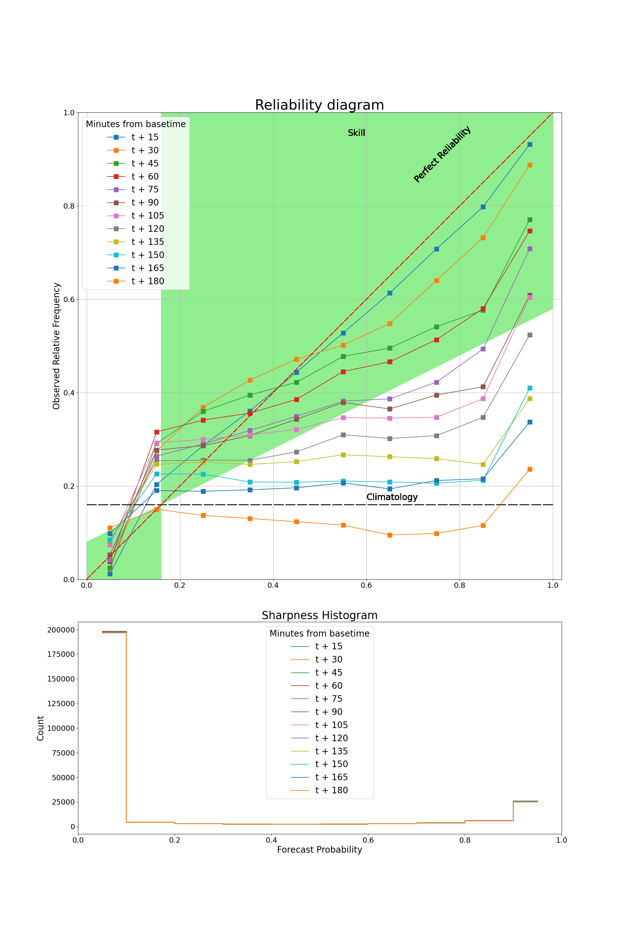
Reliability diagram and Sharpness Histogram
This section demonstrates how to obtain data and plot the reliability diagram along with a Sharpness Histogram.
The reliability diagram plots observed frequency against the forecast probability, where the range of forecast probabilities is divided into K bins (in this example, K=10).
The sharpness histogram displays the number of forecasts in each forecast probability bin.
In this example, multiple curves will be plotted for different lead times from basetime, so multiple sets of reliability diagram data will be plotted.
# Obtaining data to plot reliability diagram
# Data is stored as an xarray.DataSet
# For loop to generate data for different lead times
reliabilityDataList = []
for time in timelist:
    reliabilityData = mt.reliability(forecast.sel(time=time),
                                     observation.sel(time=time),
                                     n_bins=10)
    reliabilityDataList.append(reliabilityData)

# Concatenate reliability diagram along the time dimension
reliability_data = xr.concat(reliabilityDataList,
                                 dim=xr.IndexVariable('time', timelist))

# Plotting reliability diagram

plt.figure(figsize=(20, 30))
ax1 = plt.subplot2grid((3, 1), (0, 0), rowspan=2)
ax2 = plt.subplot2grid((3, 1), (2, 0))

for time in reliability_data.time.values:
    # Extracting DataArrays from DataSet
    observed_rf = reliability_data.observed_rf.sel(time=time)
    nforecast = reliability_data.nforecast.sel(time=time)
    time = pd.Timestamp(time)

    # Minutes from basetime
    timeDiff = time - basetime
    timeDiffMins = int(timeDiff.total_seconds() // 60)

    # Format axes
    ax1.set_ylim(bottom=0, top=1)
    ax1.set_xlim(left=0, right=1)
    ax1.set_aspect('equal', adjustable='datalim')

    # Plot reliability data
    observed_rf.plot(
        ax=ax1, marker='s', markersize=10,
        label=f"t + {timeDiffMins}"
    )

    # Plot perfect reliability and sample climatology
    ax1.plot([0, 1], [0, 1], ls='--', c='red', dashes=(9, 2))
    c = reliability_data.attrs['climatology']
    ax1.plot([0, 1], [c, c], ls='--', c='black', dashes=(15, 3))

    # Plot skill area
    x0 = np.array([c, 1])
    y01 = np.array([c, 0.5*(1+c)])
    y02 = np.array([1, 1])
    ax1.fill_between(x0, y01, y02, where=y01 <= y02, facecolor='lightgreen')
    x1 = np.array([0, c])
    y11 = np.array([0.5*c, c])
    y12 = np.array([0, 0])
    ax1.fill_between(x1, y11, y12, where=y11 >= y12, facecolor='lightgreen')

    # Labelling
    ax1.text(0.7, 0.85, 'Perfect Reliability', rotation=45, fontsize=20)
    ax1.text(0.6, c + 0.01, 'Climatology', fontsize=20)
    ax1.text(c + 0.4, 0.95, 'Skill', fontsize=20)
    ax1.grid(True, ls='--', dashes=(2, 0.1))
    ax1.set_xlabel('')
    ax1.set_ylabel('Observed Relative Frequency', fontsize=20)
    ax1.set_title('Reliability diagram', fontsize=32)
    ax1.xaxis.set_tick_params(labelsize=17)
    ax1.yaxis.set_tick_params(labelsize=17)
    lgd1 = ax1.legend(loc="upper left",
                      title='Minutes from basetime',
                      fontsize=20)
    plt.setp(lgd1.get_title(), fontsize=20)

    # Plot and label sharpness histogram
    coords = nforecast.coords['forecast_probability'].values
    data = nforecast.values
    ax2.step(coords, data, where='mid', label=f"t + {timeDiffMins}")
    ax2.set_xlim(left=0, right=1)
    ax2.set_xlabel('Forecast Probability', fontsize=20)
    ax2.set_ylabel('Count', fontsize=20)
    ax2.xaxis.set_tick_params(labelsize=17)
    ax2.yaxis.set_tick_params(labelsize=17)
    ax2.set_title('Sharpness Histogram', fontsize=25)
    lgd2 = ax2.legend(
        loc="upper center",
        title='Minutes from basetime',
        fontsize=20)
    plt.setp(lgd2.get_title(), fontsize=20)

# Saving
plt.savefig(os.path.join(OUTPUT_DIR, 'reliability.png'))
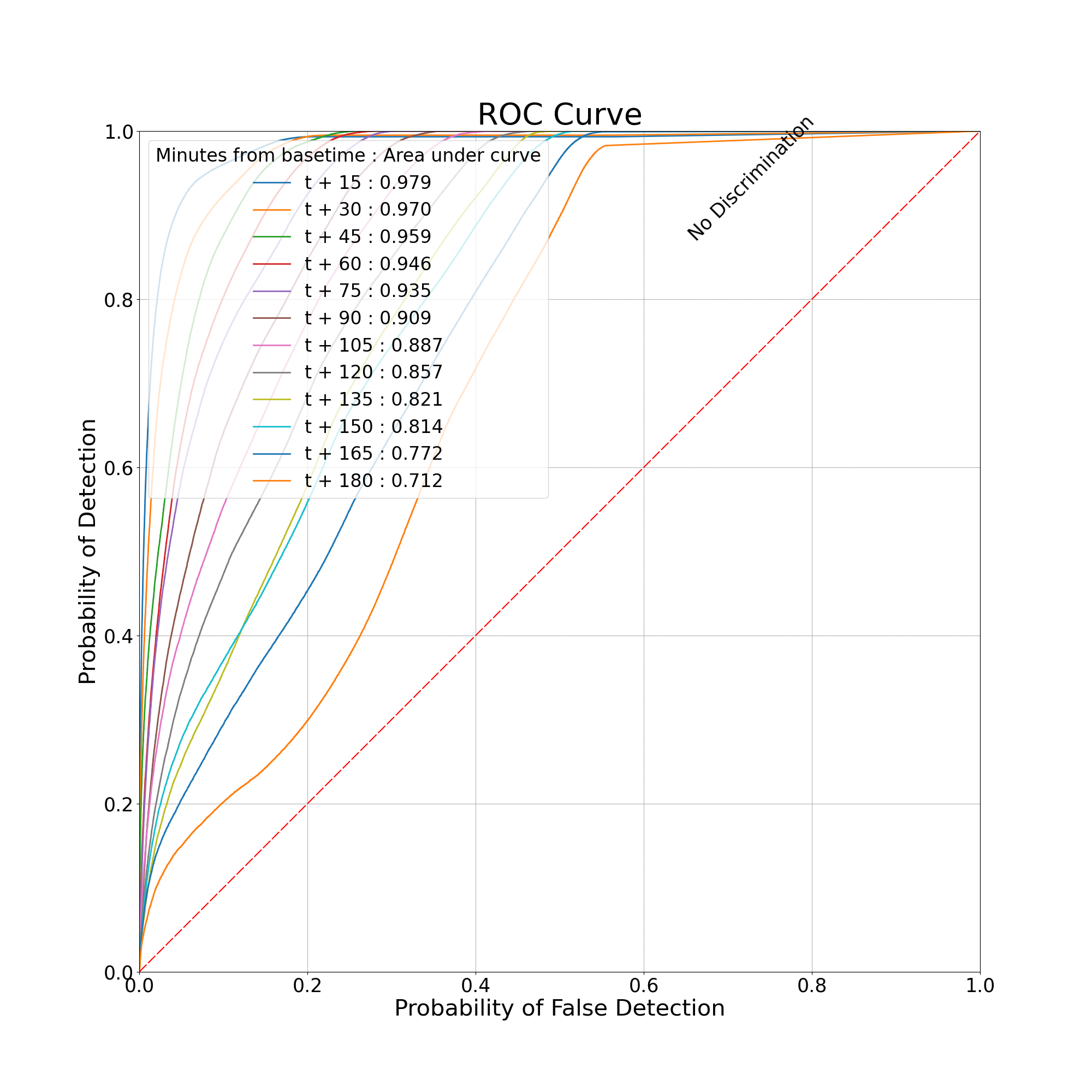
Receiver Operating Characteristic Curve (ROC Curve)
This section demonstrates how to obtain data and plot the ROC Curve.
The ROC Curve plots the Probability of Detection against the Probability of False Detection.
Similarly, in this section, multiple curves will be plotted for different lead times.
# Obtaining data to plot the ROC Curve
# Data is stored as a dictionary
rocDataList = []
for time in timelist:
    rocData = mt.roc(forecast.sel(time=time), observation.sel(time=time))
    rocDataList.append(rocData)

# Plotting ROC Curve

# Intialising figure and axes
plt.figure(figsize=(20, 20))
ax = plt.axes()
ax.set_ylim(bottom=0, top=1)
ax.set_xlim(left=0, right=1)
ax.xaxis.set_tick_params(labelsize=25)
ax.yaxis.set_tick_params(labelsize=25)
ax.set_aspect('equal', adjustable='box')

for roc_data, time in zip(rocDataList, timelist):
    # Time from basetime
    time_diff = time - basetime
    time_diff_min = int(time_diff.total_seconds() // 60)
    # Plot ROC data
    pod = roc_data['pod']
    pofd = roc_data['pofd']
    label = f"t + {time_diff_min} : {roc_data['auc']:.3f}"
    ax.plot(pofd, pod, linewidth=2, label=label)

# Plot no discrimination line
ax.plot([0, 1], [0, 1], ls='--', c='red', dashes=(9, 2))
ax.text(0.65, 0.65 + 0.22, 'No Discrimination', rotation=45, fontsize=25)

# Plotting grid
ax.grid(True, ls='--', dashes=(2, 0.1))
# Plotting labels and titles
ax.set_xlabel('Probability of False Detection', fontsize=30)
ax.set_ylabel('Probability of Detection', fontsize=30)
lgd = ax.legend(
    loc="upper left",
    title='Minutes from basetime : Area under curve',
    fontsize=24
)
plt.setp(lgd.get_title(), fontsize=24)

plt.title('ROC Curve', fontsize=40)
# Saving
plt.savefig(os.path.join(OUTPUT_DIR, 'roc.png'))
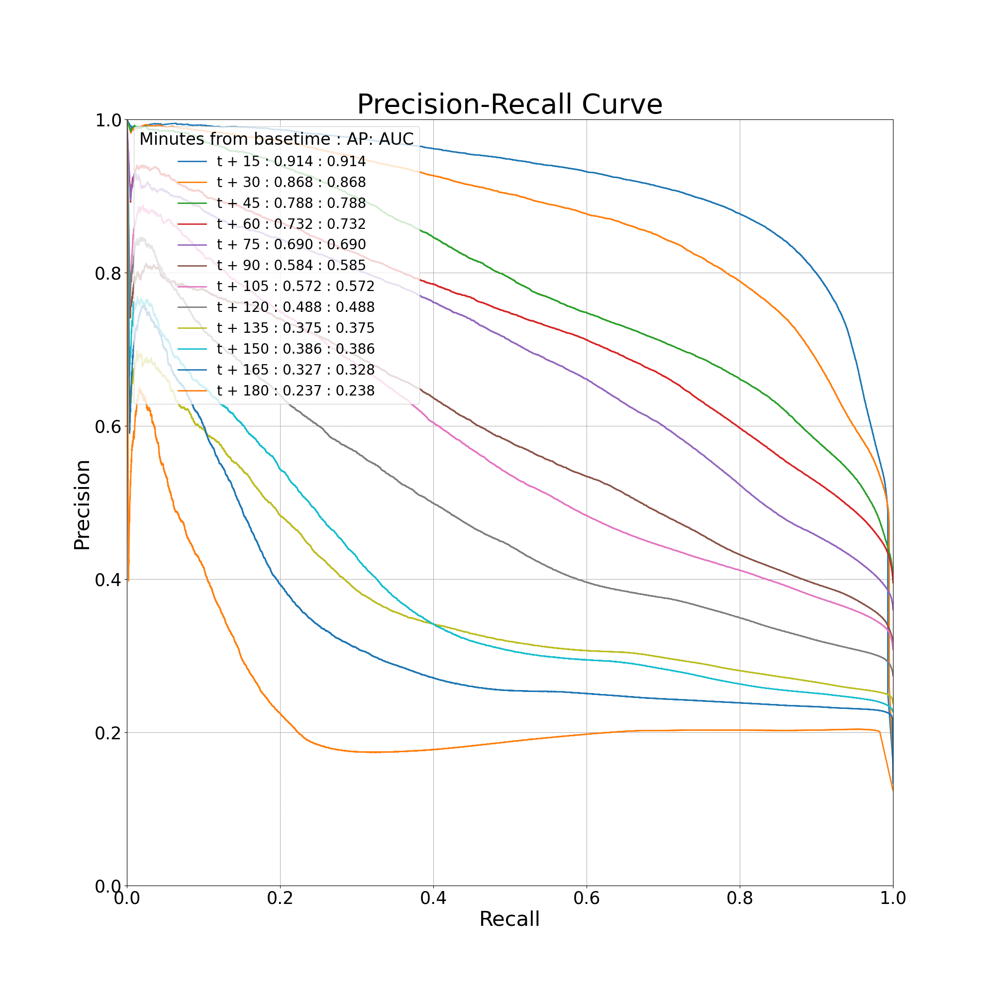
Precision-Recall Curve
This section demonstrates how to obtain data and plot the Precision-Recall Curve.
The Precision-Recall Curve plots precision, which is equivalent to 1 - FAR, against recall, which is equivalent to Probability of Detection.
Similarly, in this section, multiple curves will be plotted for different lead times.
# Obtaining data to plot the ROC Curve
# Data is stored as a dictionary
prDataList = []
for time in timelist:
    prData = mt.precision_recall(forecast.sel(time=time),
                                 observation.sel(time=time))
    prDataList.append(prData)

# Plotting Precision Recall Curve

# Initialising figure and axes
plt.figure(figsize=(20, 20))
ax = plt.axes()
ax.set_ylim(bottom=0, top=1)
ax.set_xlim(left=0, right=1)
ax.xaxis.set_tick_params(labelsize=25)
ax.yaxis.set_tick_params(labelsize=25)
ax.set_aspect('equal', adjustable='box')

for time, pr_data in zip(timelist, prDataList):
    # Time from basetime
    time_diff = time - basetime
    time_diff_min = int(time_diff.total_seconds() // 60)
    # Plot data
    p = pr_data['precision']
    r = pr_data['recall']
    label = (f"t + {time_diff_min} : {pr_data['ap']:.3f}"
             f" : {pr_data['auc']:.3f}")
    ax.plot(r, p, linewidth=2, label=label)

# Drawing grid and labelling
ax.grid(True, ls='--', dashes=(2, 0.1))
ax.set_xlabel('Recall', fontsize=30)
ax.set_ylabel('Precision', fontsize=30)
lgd = ax.legend(
    loc="upper left",
    title='Minutes from basetime : AP: AUC',
    fontsize=20
)
plt.setp(lgd.get_title(), fontsize=24)

# Title
plt.title('Precision-Recall Curve', fontsize=40)

# Saving
plt.savefig(os.path.join(OUTPUT_DIR, 'precision_recall.png'))
Brier Skill Score
This section demonstrates how to compute the Brier Skill Score.
A Brier Skill Score of 1 means a perfect forecast, 0 indicates that the forecast is no better than climatology, and a negative score indicates that the forecast is worse than climatology.
# Calculate the Brier Skill Score
for time in timelist:
    bss = mt.brier_skill_score(forecast.sel(time=time),
                               observation.sel(time=time))
    # Time from basetime
    time_diff = time - basetime
    time_diff_min = int(time_diff.total_seconds() // 60)

    print(f"For t + {time_diff_min:3} min, Brier Skill Score: {bss:8.5f}")
For t +  15 min, Brier Skill Score:  0.76821
For t +  30 min, Brier Skill Score:  0.67794
For t +  45 min, Brier Skill Score:  0.53105
For t +  60 min, Brier Skill Score:  0.46550
For t +  75 min, Brier Skill Score:  0.38219
For t +  90 min, Brier Skill Score:  0.22003
For t + 105 min, Brier Skill Score:  0.17787
For t + 120 min, Brier Skill Score:  0.04327
For t + 135 min, Brier Skill Score: -0.20706
For t + 150 min, Brier Skill Score: -0.21124
For t + 165 min, Brier Skill Score: -0.32045
For t + 180 min, Brier Skill Score: -0.59002
Total running time of the script: ( 0 minutes 6.747 seconds)